[Freeciv-Dev] Re: (PR#4807) see diplomatic/zoc state of units on the map
[Top] [All Lists]
[Date Prev][Date Next][Thread Prev][Thread Next][Date Index] [Thread Index]
This time with the PNG.  This forgetting to attach thing must be
contagious.


> On 11/08/2003, you wrote:
>
>> On Sun, 10 Aug 2003 19:19:19 -0700
>> "Morgan Jones" <morgan.jones@xxxxxxxxxxxxxxx> wrote:
>>
>>> Your own units would have the standard white bar , and other units
>>> could have red/yellow/green/blue bar as appropriate.
>>
>> Yes I also think it's better to use the hit points bar but (extreme
>> case) if an ennemy unit has 10% HP left making the distinction
>> between red and red may be hard. Why not changing the 1 pixel
>> border of the hit points bar instead and leaving the white
>> background for everyone ? Well, by using the border, the green used
>> for the allies bar should be a very light one in order it can be
>> distinguished from on the green of terrain.
>>
>> G. Gracian
>
> I had a go at the one pixel border idea but I found that unless
> you're running at a particularly low screen resolution it's really
> hard to distinguish the colours.
>
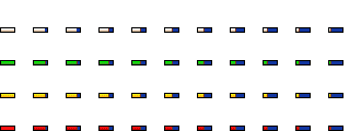
> I attached a png file for the trident tileset which has four
> different HP bar colours: white, green, yellow, and red.
>
> As to the problem of distinguishing red from red, I've changed the
> 'underlying' colour to blue. The black border is still there so this
> doesn't become a problem on ocean tiles IMO. I tried black and brown
> but these looked ugly.
>
> If someone likes this idea/graphic and is prepared to write a patch
> for it (my C is not very good), let me know and I'll convert it to
> isotrident and provide spec files.
>
>     -Morgan
>
>
> @ Gregory:
>
>> As a simpler alternative, maybe we should have diplomatic status
>> available via middle-button click.
>
> A good idea, but I don't have a middle mouse button :)  I'm sure I'm
> not the only one.  Though I guess the HP bar solution is more of a
> hassle coding-wise, it has the definite advantage of having the
> information available at a glance.

|
|