[Freeciv-Dev] (PR#14345) Re: Players dialog usability (GTK)
[Top] [All Lists]
[Date Prev][Date Next][Thread Prev][Thread Next][Date Index] [Thread Index]
|
Subject: |
[Freeciv-Dev] (PR#14345) Re: Players dialog usability (GTK) |
|
From: |
"Daniel Markstedt" <himasaram@xxxxxxxx> |
|
Date: |
Sat, 15 Oct 2005 12:44:00 -0700 |
|
Reply-to: |
bugs@xxxxxxxxxxx |
<URL: http://bugs.freeciv.org/Ticket/Display.html?id=14345 >

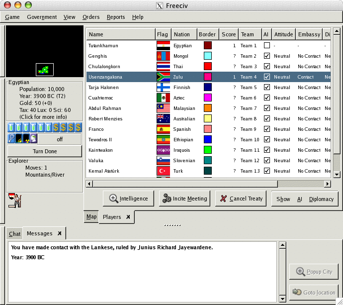
See the attached screen for my proposition for an improved Players
window. The menu should perhaps be on the left side though, to keep the
same look as in the Cities window.

What do you think?

Daniel

On 2005-10-04, at 16.47, Daniel Markstedt wrote:

> There has been improvements to the players dialog (GTK client)
> usability in CVS head. Moving the menus to the lower right corner of
> the window makes it easier to spot.
>
> Here's a few thoughts on how to improve the dialog's usability further:
>
> In the space below the list of nations and to the left of the menus,
> we could place a few buttons with shortcuts to the most commonly used
> commands. My suggestion is "Incite Meeting" and "Cancel Treaty".
>
> Also, I get the impression that many newbies have difficulties
> declaring war. Therefore I think we should have a "Declare War" option
> under the Diplomacy menu that immediately cancel all treaties in one
> go.
>
> I have no skills in GTK programming whatsoever so I'm afraid I can't
> provide a patch for this easily. It doesn't sound too difficult to
> figure out though.
>
> Daniel
>
>
>
>
>
| [Prev in Thread] |
Current Thread |
[Next in Thread] |
- [Freeciv-Dev] (PR#14345) Re: Players dialog usability (GTK),
Daniel Markstedt <=
|
|